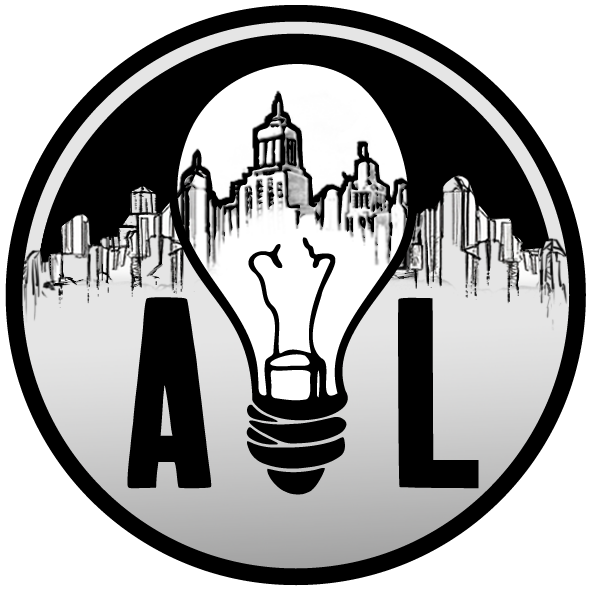
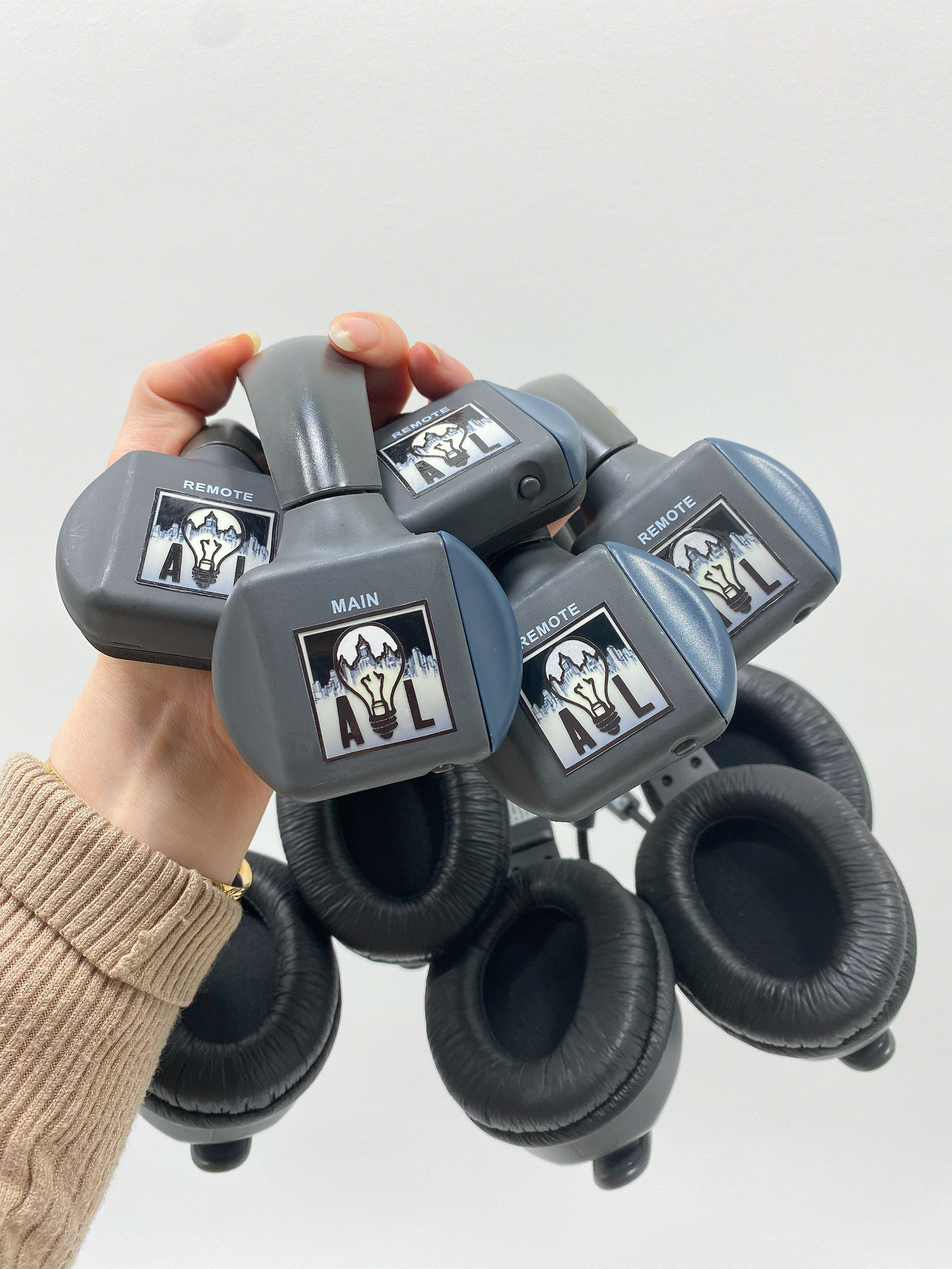

Logo design I did for a client who works professionally as a lighting-gaffer/video-producer.
He originally had a very simple icon of just his initials. He approached me with help to make a new logo and stickers for his equipment.
He had chosen the symbols of the lightbulb to represent his passion for gaffing, and wanted a city landscape to be incorporated as a point to his inspirations.
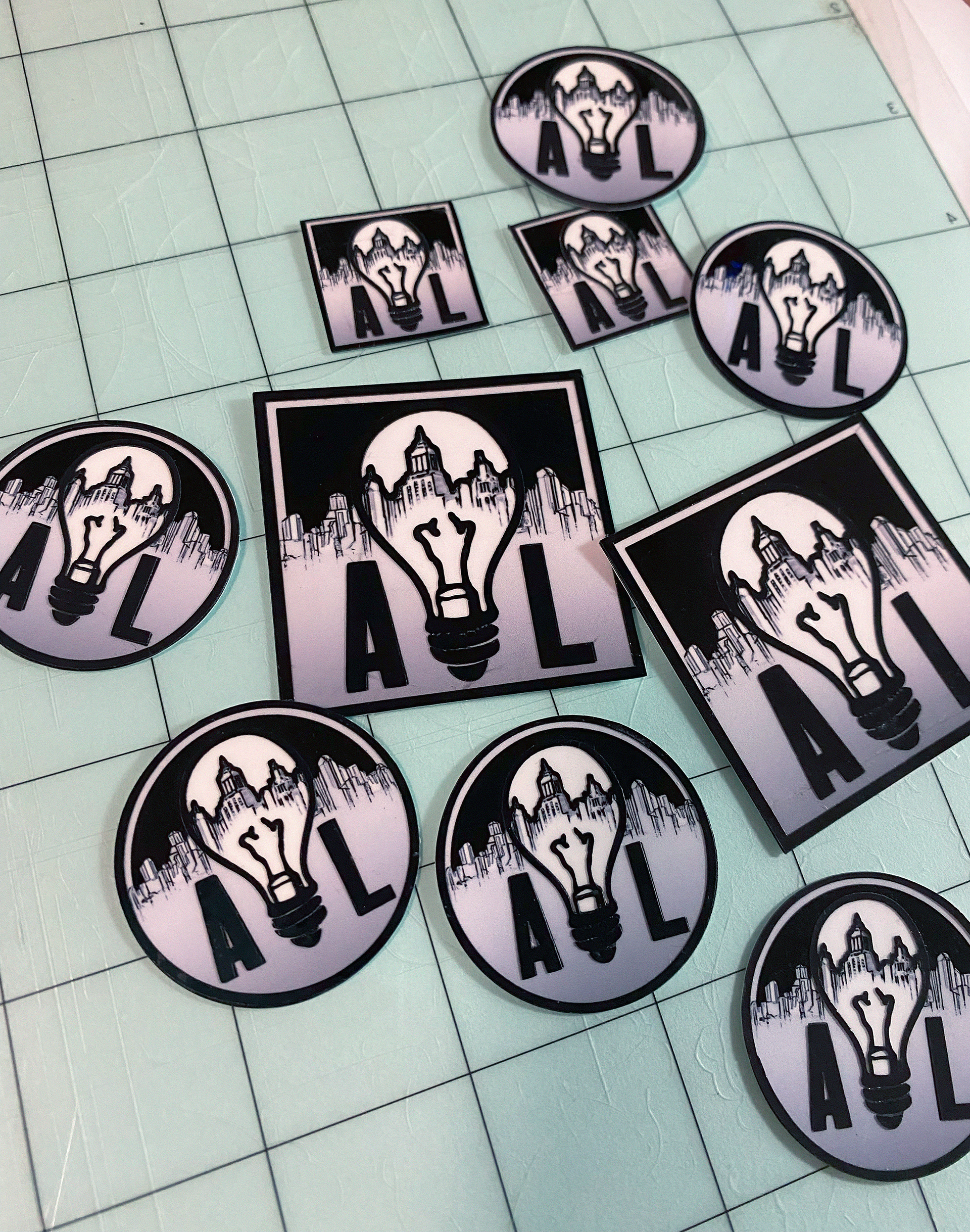
I designed his logo and then print-and-cut stickers for him to use on his equipment.
The stickers feature a cut reflective vinyl layer, giving the stickers an embossed effect.
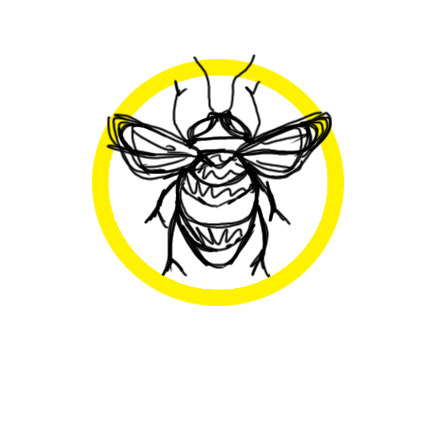
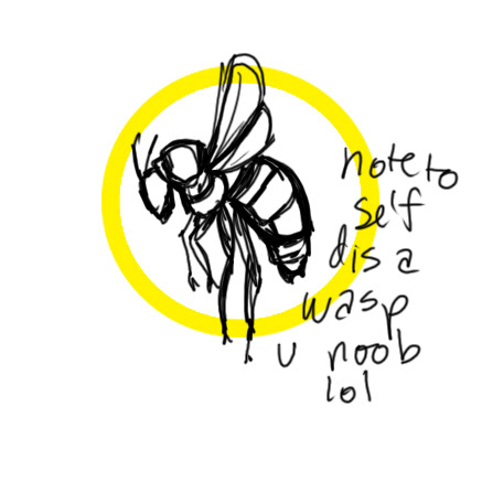
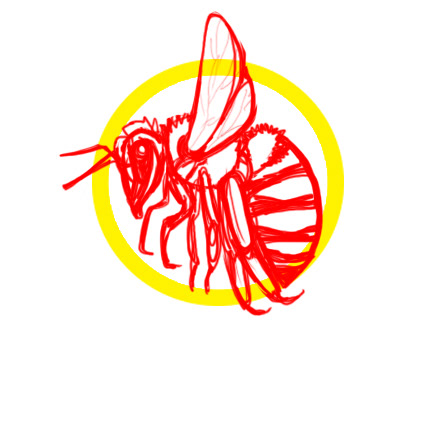
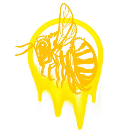
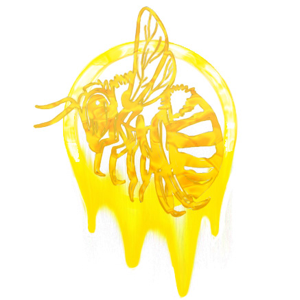
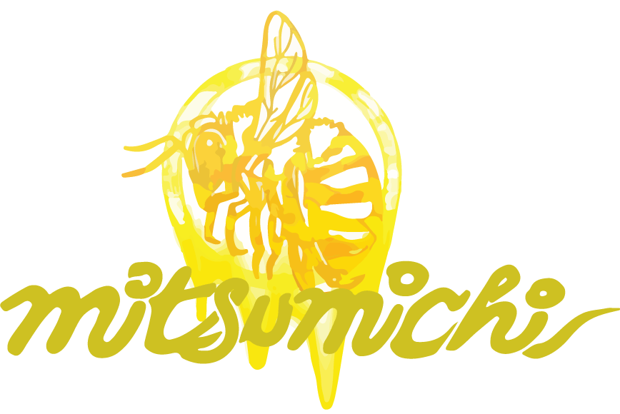
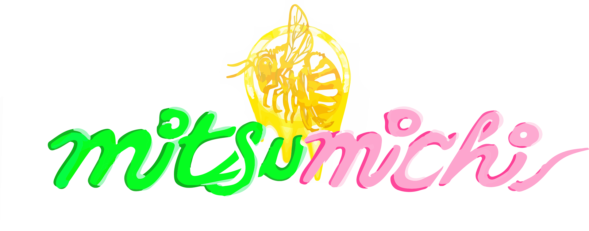
Here I have step-by-step photos of my drafting to then my end-finish icons/logos.
Above features a honey-bee, with a halo of dripping honey behind it.
The name "MITSU-MICHI" was a combination of 2 different words that mean "honey" in Japanese (the combination of "mitsu" and "michi" does not directly translate to anything in the language but for this idea it was intended to imply "honey-honey")
This concept was for a brand-idea centered around cute, "kawaii" themed goods, including stationary, planner stickers, etc.
Honey is a sweet, versatile, golden-color syrup of life, that not only has so many beneficial qualities, but is a beautiful result of hard-work and community of a tiny important creature of our ecosystem.
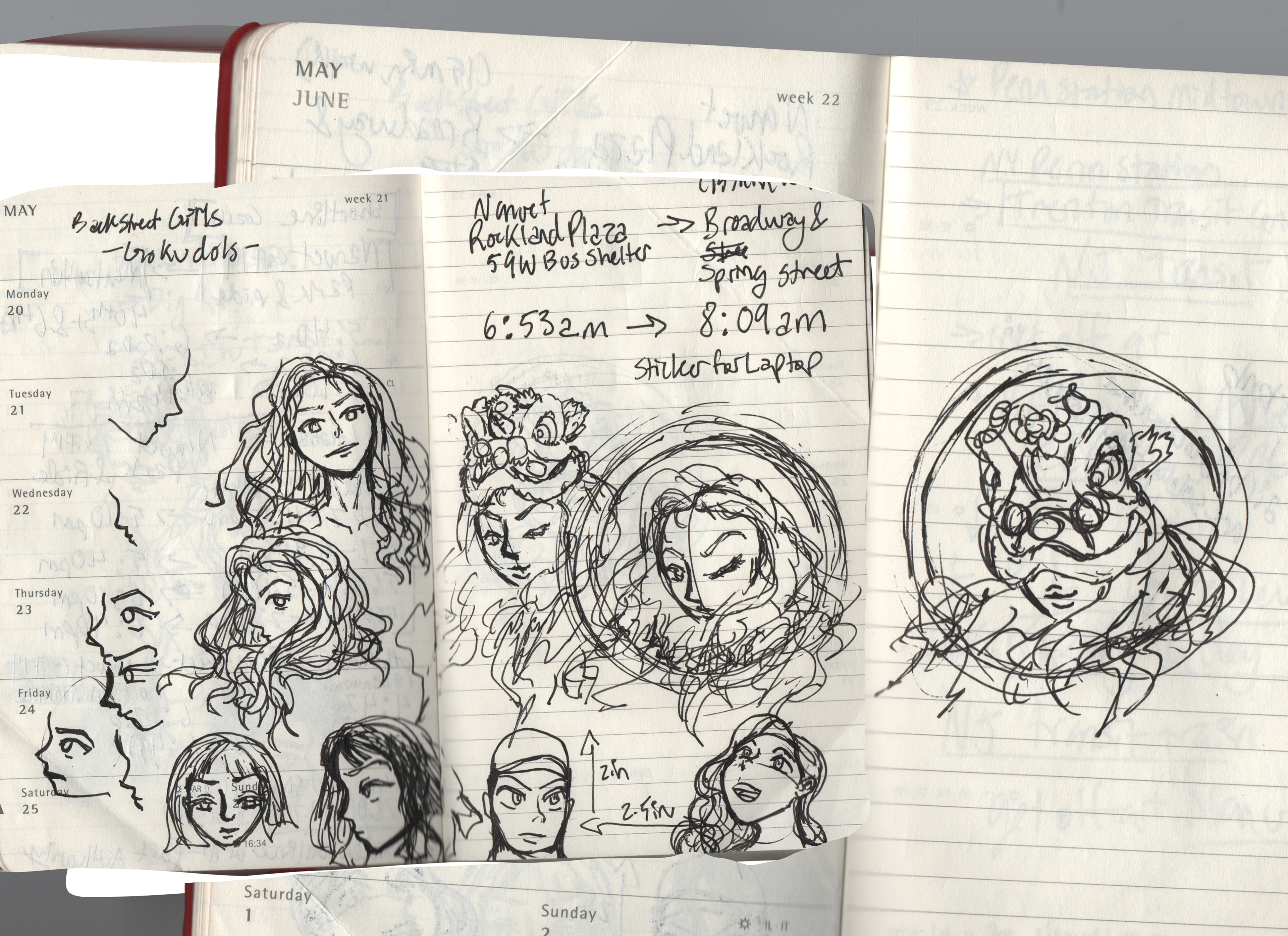
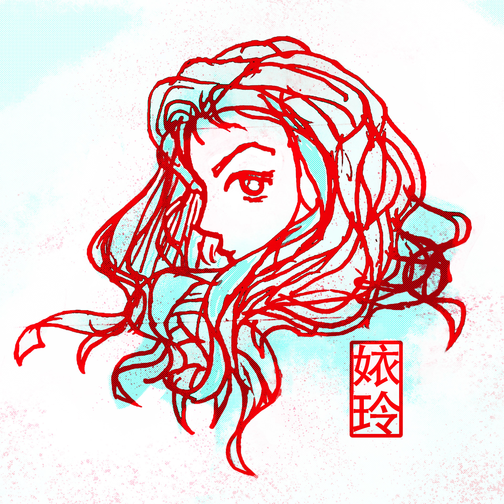
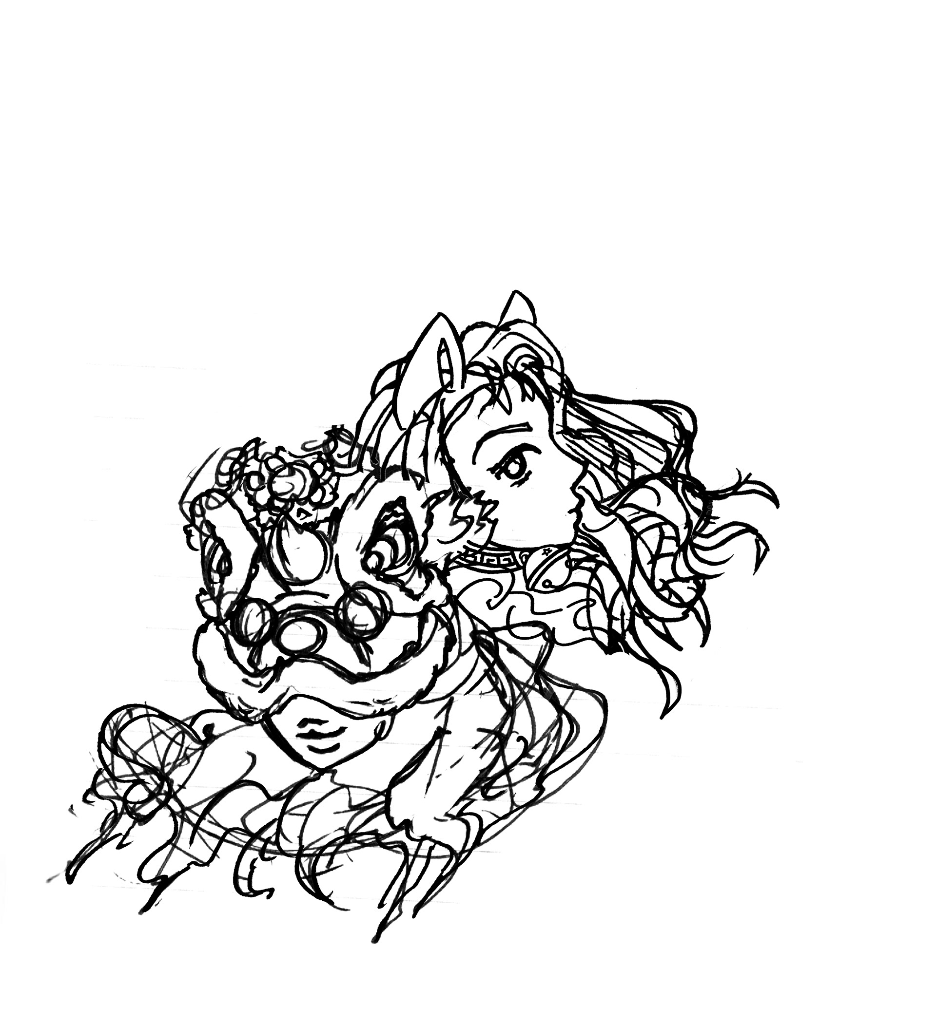
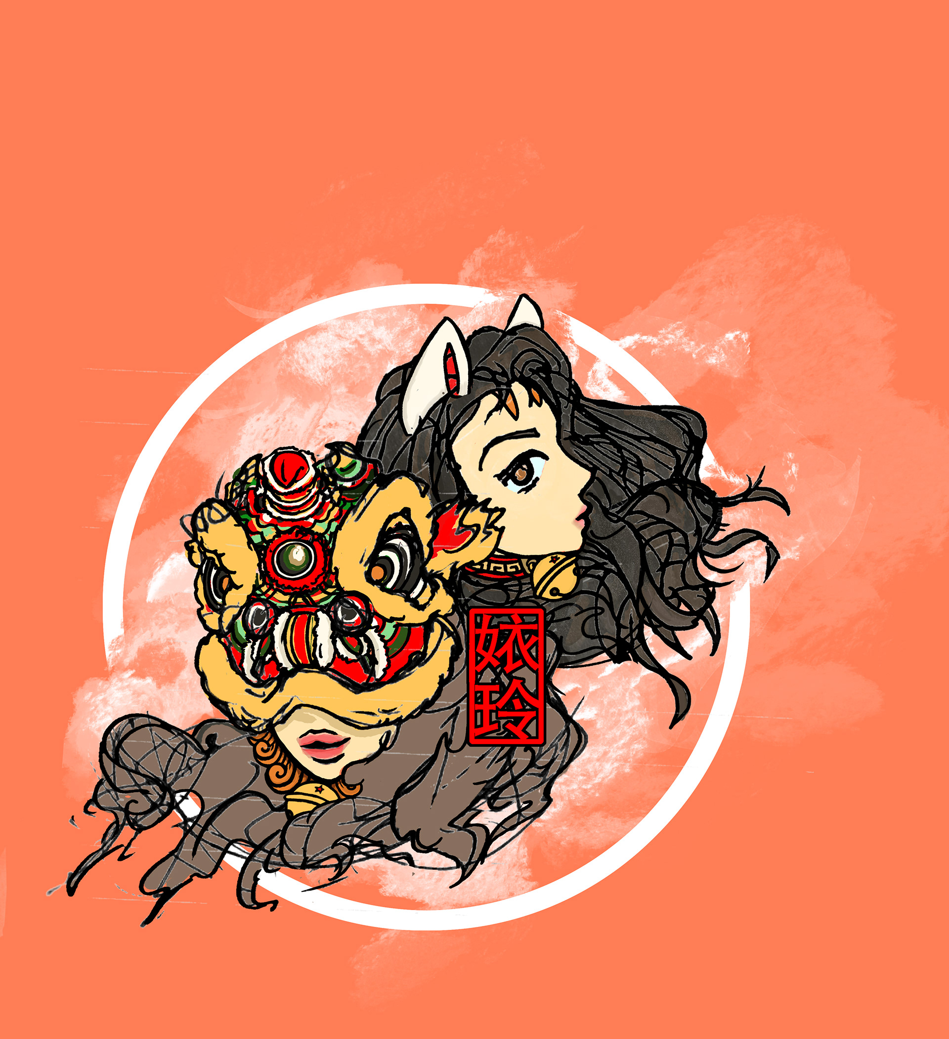
As you've seen as my website icon, this is my personal design I use to represent my artistic, creative endeavors.
It first started out as doodles in my little pocket Moleskine planner.
In the beginning of 2021, I temporarily drafted up the Red-Cyan version and used that for a short period of time. It was far from a full, finished design.
When I had time towards the end of 2021, I ended up fleshing the idea out more,
I pulled another separate drawing that was initially meant for my GLXOG brand.
I combined it, with the result being a design I have fallen in love with.
I pulled another separate drawing that was initially meant for my GLXOG brand.
I combined it, with the result being a design I have fallen in love with.
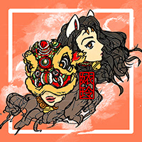
It features 2 girls,
one that is donning a lion fu-dog hat
(partially inspired by Hayao Miyazaki's Studio Ghibli character, Princess Mononoke),
and the other which references "Lucky Cats"
(like the ones you see waving to you with its little robotic arm at Asian Restaurants),
and a deep-red, stamp-like insignia of my Chinese-name ("Yi-linh"),
The meaning I wanted to convey, draws from symbolism prevalent in my up-bringing/culture, and my inspiration of strong, beautiful, women characters.
It's truly an amazing feeling to be able to fall in love with your creations,
whether in imagination, and then in actuality.
whether in imagination, and then in actuality.
